mKwadratHousing cooperatives, but simplified
A prototype app for housing cooperatives that makes building management and communication with residents easier. Designed and built by a five-person team during our UX Design postgraduate studies.
- RoleUX / UI designer
- TeamMaja Korzeniewska
Dominik Banasiak
Martyna Boreczek
Monika Bugała
Marysia Ziembicka - TypePrototype app
- Year2025
Discovery & research
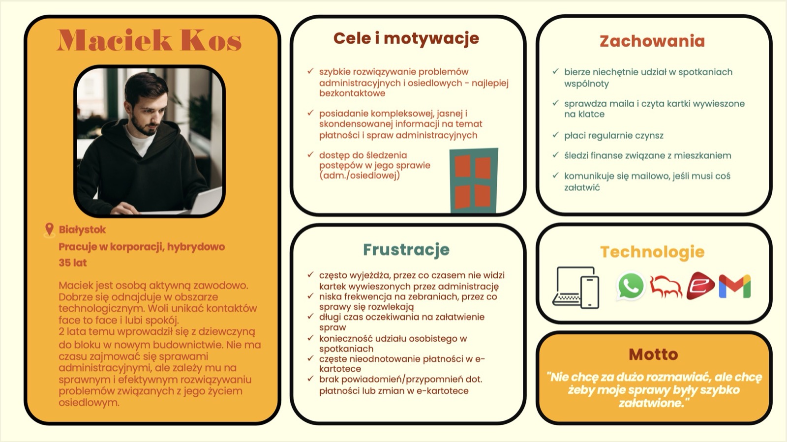
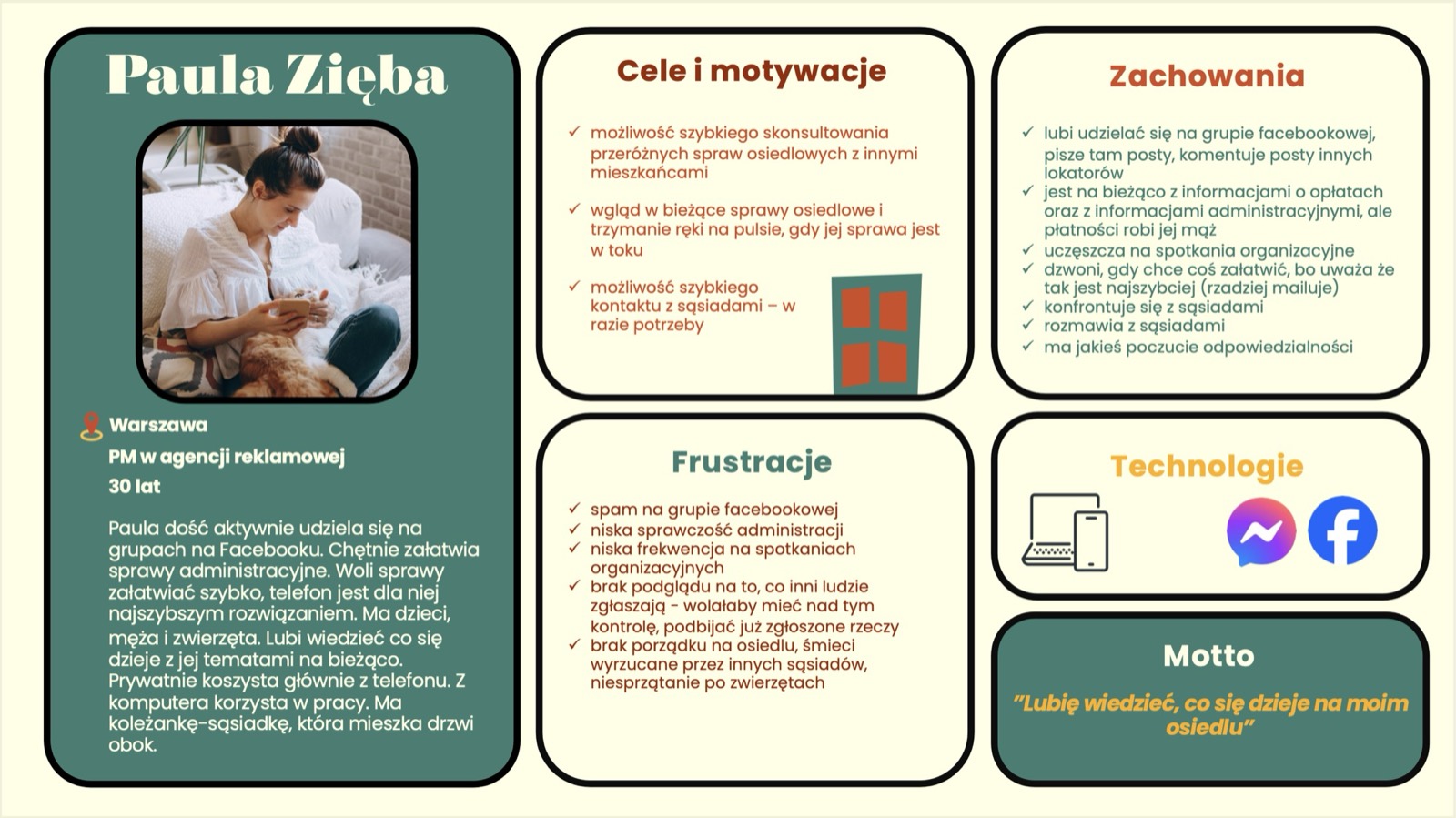
Key Insights: Residents feel a lack of engagement and frequently ignore paper notices in stairwells. They are also discouraged by legal jargon and low attendance at community meetings.
Ideation & structure
Tone of Voice: We adopted a casual, human TOV (“Your administration, but human”) to reduce stress and shorten the distance between residents and the administration.
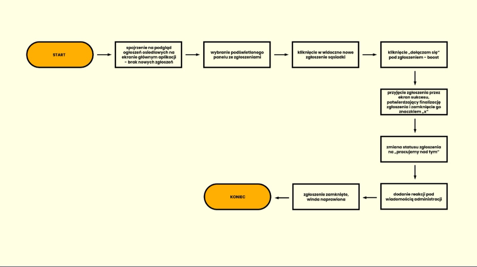
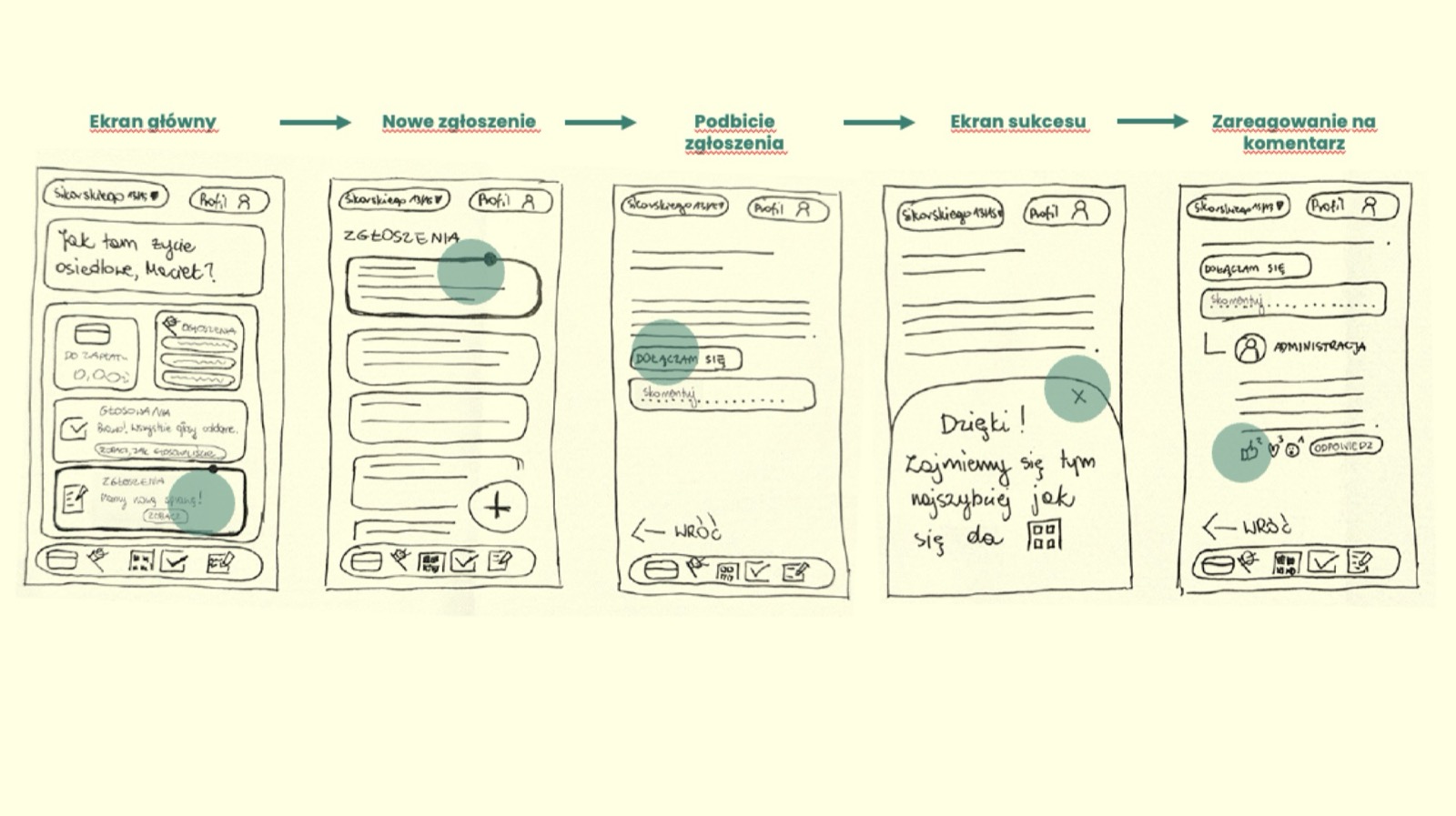
Features: We focused on user flows that minimize effort, such as quickly viewing payment history or the option to “boost” existing issue reports instead of duplicating them.
Usability testing & changes
We conducted moderated usability tests with 10 users. Key improvements included:
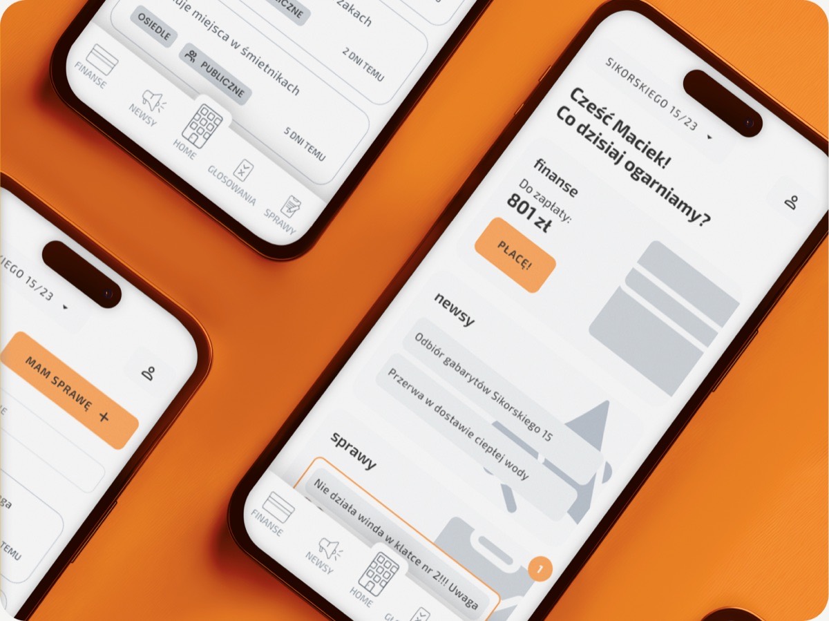
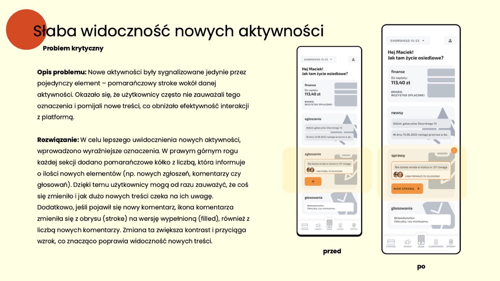
Notifications: Replaced subtle orange strokes with numerical badges, as users were missing new updates.
Navigation: Added a bottom navigation menu on screens where users were getting stuck and could not return to the home page.
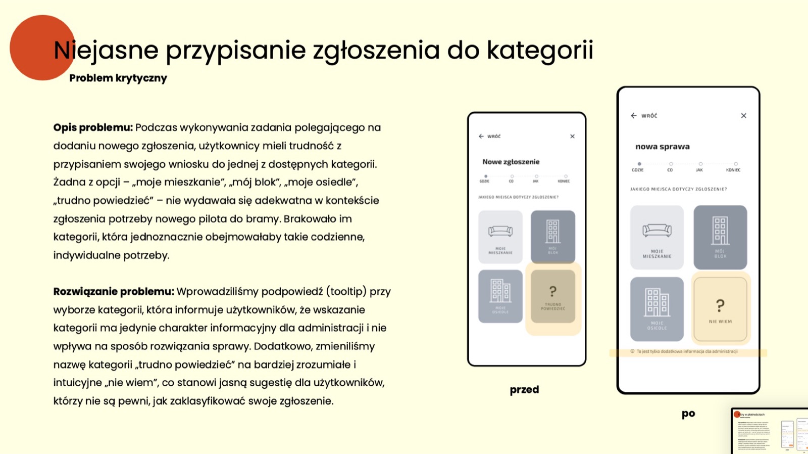
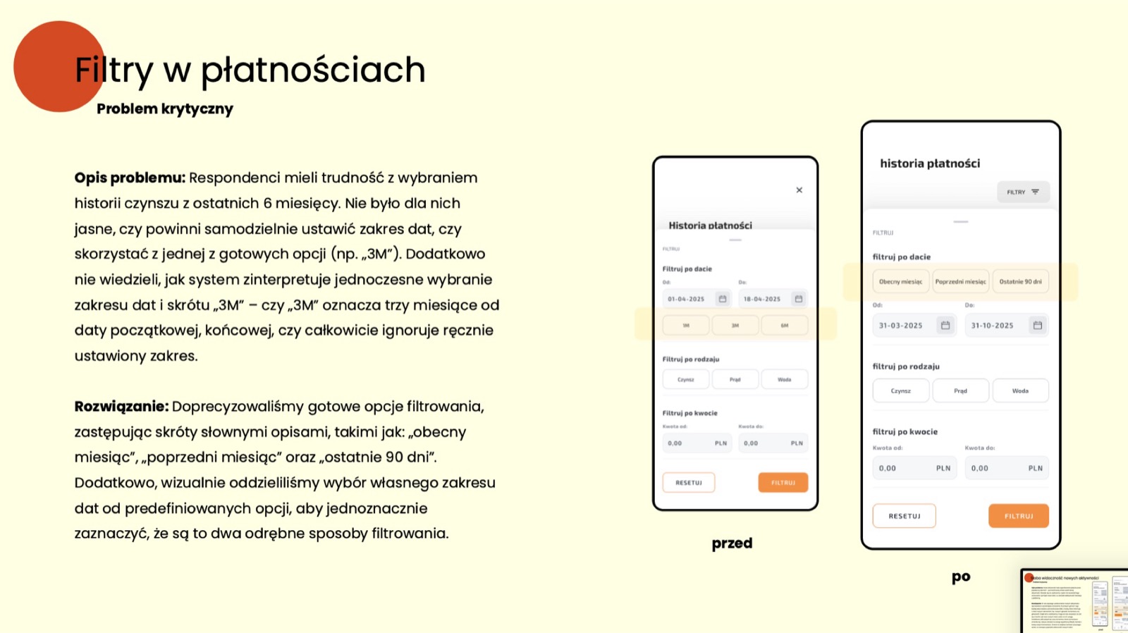
Payment Filters: Changed confusing short forms (e.g., “3M”) to descriptive labels (“last 90 days”).
Final solution & outcomes
Result: Users appreciated the app for making daily life easier and for its high intuitiveness. The feature allowing residents to support (“boost”) an issue significantly built a sense of community.
Learning: Testing proved how critical UX Writing was: changing a button label from “Podbijam!” (“Boost!”) to a more direct action unblocked the flow for many respondents.